Visualizing Clustering Results in R
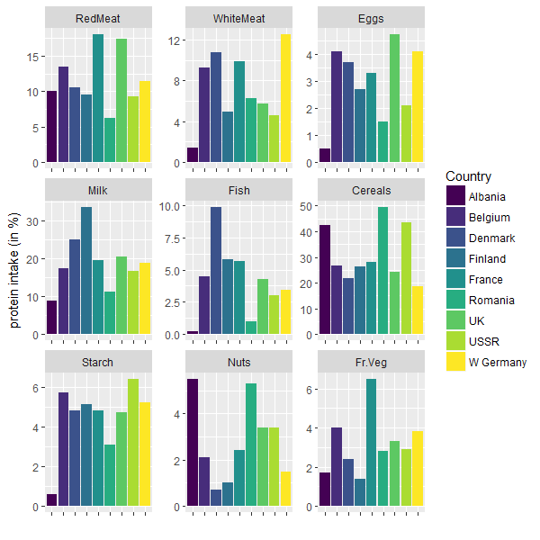
Recently I thought about how to visualize the result of a cluster analysis. I do not mean the visualization of the clusters itself but the results in terms of content and variable description – something you could give away to someone who does not understand the mechanics of cluster algorithms and just want to see a description of the resulting clusters. I came up with a ggplot solution which looks like the following.
You can find the code to produce this simple ggplot graph on my Github.