Bike Sharing in Hamburg
Read an article on the usage of open data for bicycle traffic planning on my Medium (in German).
Some important information on this project:
- Data: http://data.deutschebahn.com/dataset/data-call-a-bike
- Use the map here: https://alexkruse.shinyapps.io/stadtrad/
- I created a Poster for useR 2017 Poster Session and done a workshop for OpenStreetMap.
My interactive map shows the bike sharing usage of StadtRAD, the bike sharing system in Hamburg – Germany. The data is available on the open data platform from Deutsche Bahn, the public railway company in Germany. The last new StadtRAD station was put into operation in May 2016, that is why a have chosen to display the usage of June 2016. The brighter the lines, the more bikes have been cycled along that street.
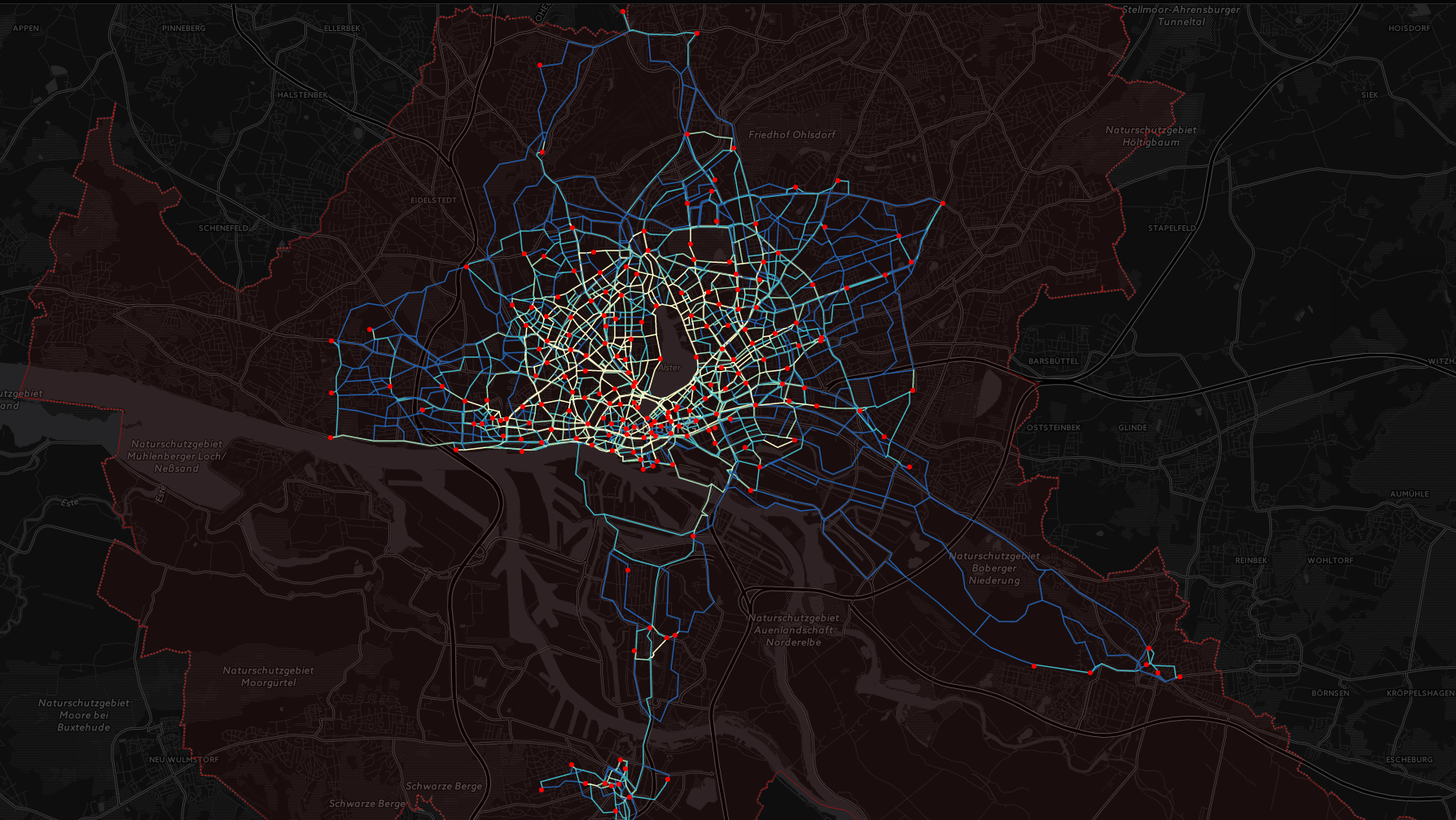
From data processing and spatial analysis to visualization the whole project was done in R. I have used leaflet and shiny to display the data interactively. The bikes themselves don’t have GPS, so the routes are estimated on a shortest route basis using the awesome CycleStreets API. The biggest challenge has been the aggregation of overlapping routes. I found the overline function from the stplanr package very helpful. It converts a series of overlaying lines and aggregates their values for overlapping segments. The raw data file from Deutsche Bahn is quite huge so I struggled to import the data into R to process it. In the end the read.csv.sql function from the sqldf package did the job.
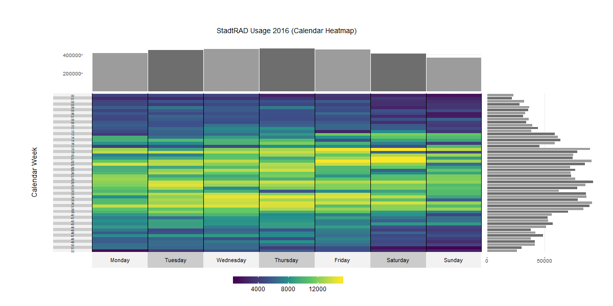
To further analyze the StadtRAD data I also took the full booking data from 2016 and did some diagrams. The first one is a calendar heatmap where you can see the amount of rented bikes aggregated on a daily basis. On the top of the graph you can see a barplot representing the rented bikes aggregated by the day of week. On the right you see a barplot to display the StadtRAD usage for each calendar week of 2016. The idea to use calendar heatmaps to display bike sharing usage comes from Via Velox. The code to create this heatmap is also in this Repo.
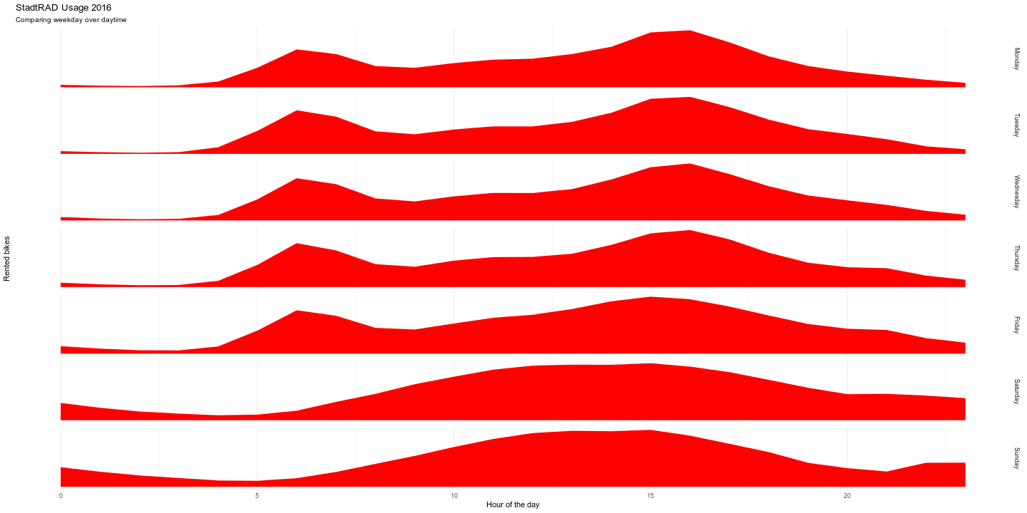
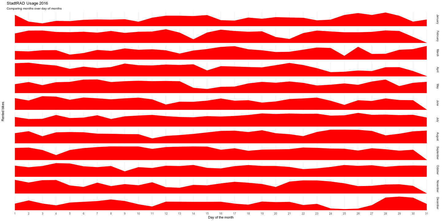
I also created joyplots with ggplot to display and analyze the data. The first one shows the daily usage of every weekday. You can see big differences between working days and the weekend.
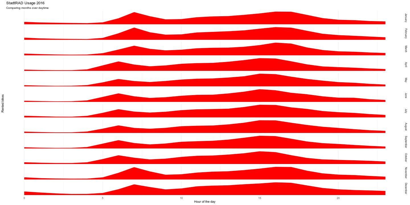
The next diagram shows the daily usage per month. You can see that people renting bikes earlier in the summer.
The last diagram shows the differences between the months on a daily basis. You can see that people were not using StadtRAD a lot during chrismas.
You can fine the code on my Github.