Marathon Hamburg
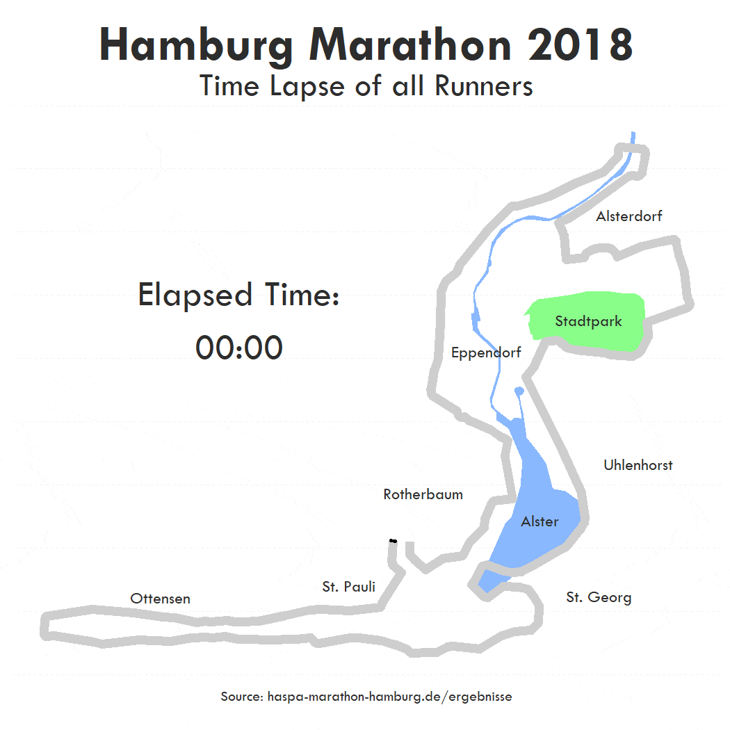
I came across this cool piece of data vizualization from the folks of Berliner Morgenpost. I thought it would be nice to re-create the whole visualization for the Hamburg Marathon 2018. I came up with a complete R-based solution. The animated visualiaztion itself is made out of multiple ggplot outputs.
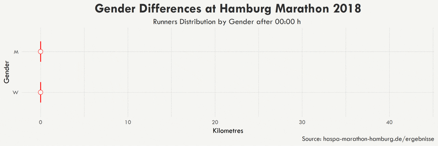
I also analyzed the gender differences at the Hamburg Marathon 2018. I would say it is a proper misuse of error bars :) It is the same thing here, I just put together multiple ggplot outputs into a gif. I also tried out violin plots but they did not seem to work in an animated visualization because all runners are at the same position at the start which completly distroys the scale and y-axis.
As always, you can find the code for both visualizations on my Github.